A Square is Born: The Thinking Behind Sundance’s New Plaza
On November 1st, the citizens of Fort Worth will experience the most dramatic change to their downtown since the discovery of oil in 1917. What most of them may never realize is that this event was part of a plan conceived 25 years ago. It is but one of many important milestones that have characterized the renaissance of downtown Fort Worth over the last quarter century. We hope we have contributed to making Fort Worth a better place to live, work and play.
This is the final installment of three posts related to our work in Fort Worth. To recap, the first post gave a brief history of how we came to be involved in three decades of planning and architecture in Fort Worth, TX. The second installation delved into the planning issues we encountered and provided background on several of the projects that came about and helped spark the renaissance of downtown Fort Worth.
In 2010, as the country was deep into the worst recession since the Great Depression, Edward Bass, Fort Worth native and Sundance Square visionary, and Johnny Campbell, the President of Sundance Square, decided it was time to begin design of the two blocks that had been set aside almost 25 years before as the central public plaza for downtown Fort Worth. Our firm found itself with the opportunity to design something that it had planned a quarter century earlier – not something that happens every day in the life of an architectural firm.
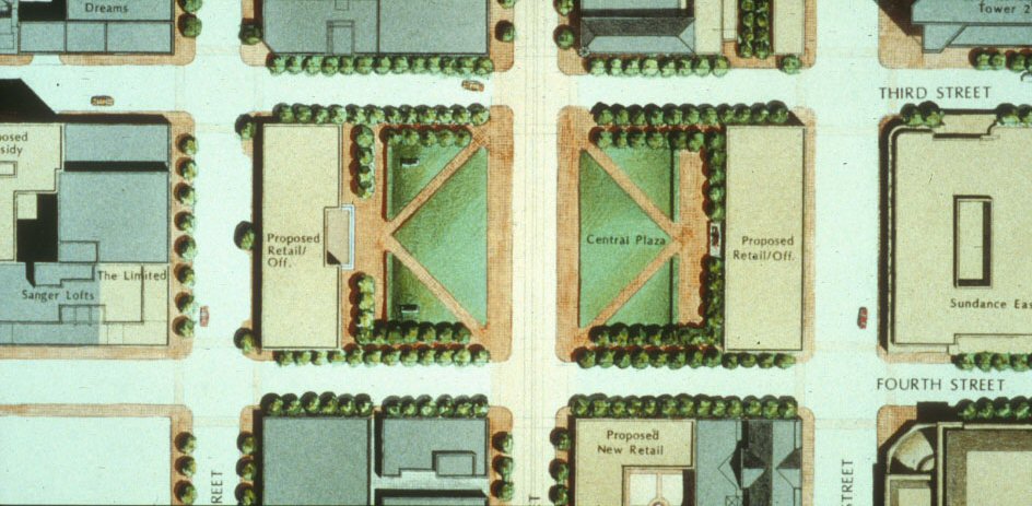
Downtown Fort Worth Master Plan (1988) showing the central plaza straddling Main Street.
A brief explanation about “Sundance Square” is in order. Not unlike New York’s Union Square or Washington, DC’s Dupont Circle, Fort Worth’s Sundance Square refers both to a physical public open space and also to a larger neighborhood that it anchors. However, unlike New York or Washington, the space that has defined Sundance Square for the last generation did not physically exist in the way one would typically imagine a significant public space. It was composed of two asphalt parking lots.
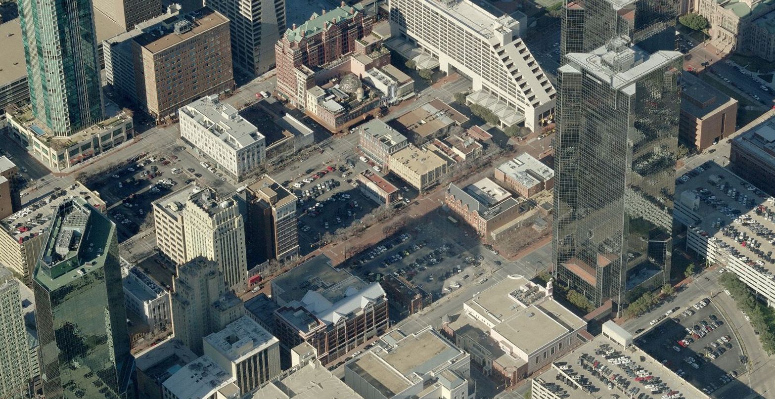
Sundance Square as it looked in 2010. The actual “square” is the two blocks of parking in the center of the photo.
That’s not to say that the space was not utilized for public events. In an amazing transformation that happened more and more often as the years went by, the parking lots became home to a range of events: summer movie nights (imagine sitting on asphalt to watch a movie after a day soaking up the Texas sun!); weekend farmer’s markets; the Christmas tree lighting; professional boxing matches; and the annual Main Street Arts Festival. The culmination of these events was the selection of Sundance Square to host ESPN’s production headquarters during the week-long lead up to Super Bowl XLV in 2011.
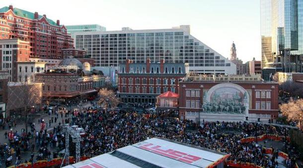
Just prior to construction of the new plaza, Sundance Square hosted ESPN for the week leading up to the 2011 Super Bowl.
Our client, Sundance Square, the development company who owns the land and is developing the neighborhood called by the same name, was clear from the beginning of the design process that the events that had been taking place in the old space had to be accommodated in the new square, e.g., the square had to be conceived as a plaza and not a park. That important distinction guided many decisions during the planning and design phases.
The widely varied types of activities planned for the plaza posed challenges in how the space should be configured. On one hand, there needed to be a large area for thousands of people to gather with uninterrupted views of a performance and the infrastructure to allow semi-tractor trailers to maneuver and large temporary installations (like the ESPN stage) to be set up. On the other hand, the space needed to have a level of intimacy and comfort for individuals and smaller groups who would be using the space over 90% of time.
While identifying and developing the plaza program was a critical part of ensuring that the plaza would be a functional and financial success, it was the larger vision that this space should become a significant civic amenity for the citizens of Fort Worth that will secure its legacy. With this in mind, we studied and compared many of world’s greatest public spaces, from St. Mark’s Square in Venice and the Piazza della Signoria in Florence to Union Square in San Francisco and Bryant Park in New York. We also studied how recently constructed, successful urban plazas and parks like the City Garden in St. Louis, Pioneer Square in Portland, and Chicago’s Millennium Park, were designed and what kinds of amenities they provided.
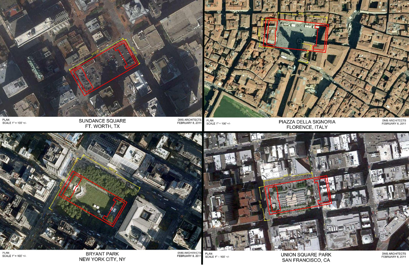
Space comparison studies showing the plan of Sundance Square superimposed on aerial views of various notable public spaces.
Through these studies and discussions, we came to the conclusion that the framework of Sundance Square should be designed in a timeless aesthetic, with materials and details that were durable and clearly evoked the unique Fort Worth context. At the same time, there was a strong desire to incorporate unexpected and singularly unique elements into the plaza’s design.
The first task we undertook on was to evaluate the notion of defining the plaza with two new office buildings located on the far east and west of the overall two-block site. In the original planning study, these “bookend” buildings served several purposes. First, they helped activate the streets they faced, Commerce Street on the east and Houston Street on the west, with retail storefronts. The reactivation of the streets at the pedestrian level was the overarching goal of the original study. Second, the buildings provided locations for retail and restaurants that would front directly onto the new plaza and provide covered seating areas along the edges of the plaza. Third, they provided additional office space which benefited not only the developer, but all of downtown by providing more Class A office and more patrons for the burgeoning retail/restaurant scene.
It was clear, however, that the new buildings had to be limited in depth as the area requirements for the plaza were critical to accommodating the larger events. Ultimately, we confirmed that the buildings and the plaza could indeed all fit on the site; the office buildings would have depths of approximately 70’ to 90’ to provide adequate space for the plaza and flexibility in the layout of offices in the buildings.
As the construction rose out of the ground over the last year and a half, many people have remarked about the size of the new buildings. While some people feel that the buildings, at heights varying from 3 to 6 stories, are perfect complements to the existing Sundance context, others wonder why the buildings weren’t designed as “skyscrapers”. The reasons for the latter is more complex than one might think.

Massing studies of the Commerce Building (left) and The Westbrook (right).
The size of the buildings was limited by the lack of dedicated parking. But, more importantly, the goal was to build on the environment that makes the Sundance Square neighborhood so unique and attractive – its buildings’ wonderful human scale and the vibrant street life.
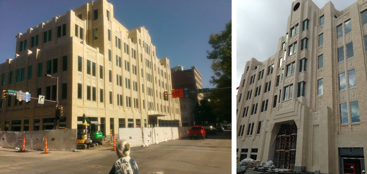
On the east side of the plaza, in what is now the Commerce Building, we designed a 5-story building that thoughtfully steps down to the south where it meets the Land Title Building so as not to overwhelm this existing historic building, and, similarly, steps down to the north as a nod to the existing Knights of Pythias building.
On the west side of the plaza, we decided that a more symmetrical and monumental massing was appropriate, especially as the idea to incorporate a permanent stage and clock tower on the plaza side of what is now known as The Westbrook was developed. However, here too, we stepped the corners of the building down to acknowledge the lower scaled buildings that define much of the neighborhood and to provide balconies for offices in this structure.
We have been extremely fortunate to collaborate with Michael Vergason Landscape Architects on the design of the plaza itself. In addition to making sure the overall vision of the plaza as a civic space was addressed and the myriad requirements outlined by the Program accomplished, there were significant technical, topographic and political (imagine that!) challenges that had to be addressed.

Main Street during the Main Street Arts Festival (left) and during a normal day (right).
Of particular interest was the process by which Main Street, which bisects the plaza, would come to be closed to vehicular traffic. At the outset, the direction from our client was that the plaza needed to function both ways, with and without the street in operation, with the street remaining open the majority of the time. During the course of designing the plaza, the City actually brought up the idea of closing the street. They saw the advantages that a unified public open space would bring to downtown. The fact that Main Street was not a heavily traveled vehicular thoroughfare and that the street was already closed for long stretches of time during Christmas and many of the large events also gave credence to its closing.
However, it was extremely important to our client that the plaza be designed such that Main Street continued to visually connect the Courthouse that anchors it on the north to the Convention Center that anchors it on the south. On first glance, as one walks north or south on Main Street today toward the new plaza, they will not notice much of a change to the view; the openness defined by the street right of way and the paving appear as it always has. On closer inspection, and as one reaches the plaza, one will see a sophisticated weaving of the brick and granite paving that both continues to define Main Street yet connects the two sides of the space into a cohesive whole.
While Main Street is now raised to the level of the plaza, each end of the street is sloped down at the precise angle so that the livestock in the annual Stock Show parade can still walk all the way along Main Street (this is still Fort Worth after all!).
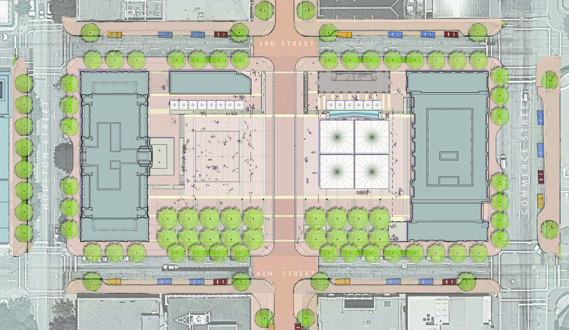
Site Plan showing the proposed plaza with the Westbrook and Commerce Buildings (drawing courtesy of Michael Vergason Landscape).
In addition to the relatively large crowds generated by events like concerts and art fairs, there was a programmatic desire for the plaza to accommodate smaller functions: puppet shows, lunch-time entertainers and small ensemble performances. But how can a 300’ by 200’ space that needs to accommodate thousands of people at a rock concert also feel comfortable to a mother and her two kids?
The solution is based on the notion of designing the edges of the space as flexible transition zones. Since the west side of the plaza was already defined by the historic Jett Building on the north (with its memorable mural depicting the Chisolm Trail), it felt appropriate to create a complementary structure on the east side. This building, which is designed as a glass and metal pavilion, houses a multi-use indoor-outdoor space with large overhead doors and restrooms. Taking advantage of the site’s slope, the plaza areas fronting these two small buildings are terraces overlooking the larger plaza, which provide wonderful spaces for tables and chairs with umbrellas.
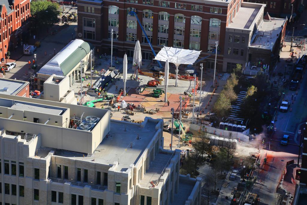
Construction photos of The Westbrook fronting Houston St. (left) and the clock tower and stage facing the plaza (right).
On the south, the plaza is defined by a double row of Cedar Elms under which will be movable chairs and tables to provide a different kind of shaded experience for individuals and small groups. On the north and south sides of the plaza, restaurants with extended areas of covered outdoor seating will activate the plaza day and night. The focal point of the plaza is the prominent clock tower at the center of The Westbrook that opens up at its base to become the stage on which many of the plaza’s events will now take place.

Construction photos of the Commerce Building and Pavilion that will house restaurants with extensive outdoor seating on the plaza.
You might have noticed the mention above of “covered seating” several times. The issue of protecting people from the sun and keeping them cooler is a primary goal in outdoor Texas. Three of the signature elements incorporated into the plaza are designed with shade and cooling in mind, and each add to the unique character of the space.
The first is the four gigantic umbrellas. Designed and manufactured in Germany, these incredible structures define a covered area (each are 40’ square) within the larger open space without affecting views to the stage. These sculptural, upside down looking contraptions not only filter direct sunlight, they collect any rain that falls on their surface and automatically retract in response to wind speed. The Teflon fabric can also be used as a surface to illuminate and project images on in the evenings.
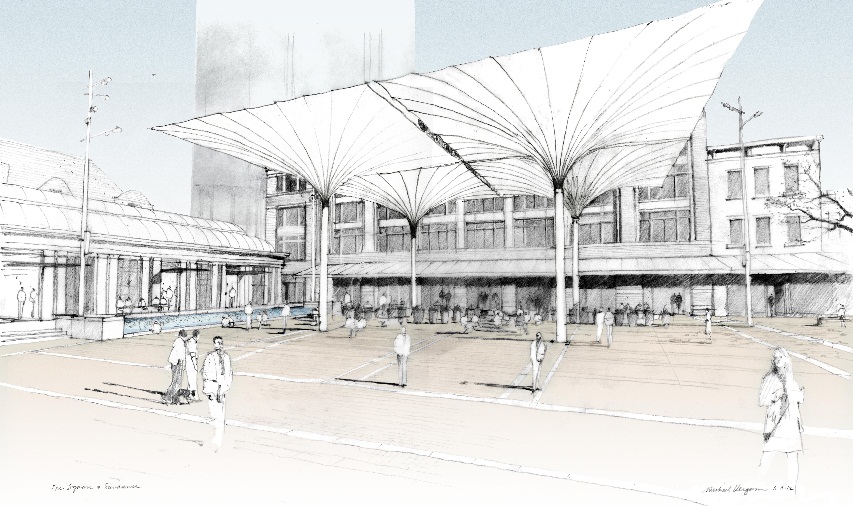
The giant umbrellas as conceived (drawing courtesy of Michael Vergason Landscape).
The other signature elements are the two water features. On the east side in the zone between the upper terrace at the pavilion and the plaza, the design team located a “wave wall”, a feature in which a very powerful pump produces a wave of water from an underground tank that is directed over a cascading granite wall. It’s a completely unique design that is sure to be a hit with kids and adults alike.
Centered on the west side of the plaza, the design team incorporated a jetted fountain comprising 216 smoothbore nozzles set flush into the granite pavers that is infinitely programmable to create plumes of dramatic water up to 12’ high or a much calmer membrane of still water only ¼” deep over a rectangular area 52’ by 60’. For large events, the fountain is turned off and the dry pavement becomes a seamless extension of the plaza.

The various moods of the jetted fountain (drawing courtesy of Michael Vergason Landscape).
We are truly honored to have been a part of this transformational project and look forward to celebrating the opening with our client, team members and the citizens of Fort Worth. It has been our privilege to work in downtown these past 25 years and we can only hope to celebrate more milestones in the next 25.
The opening celebration for the plaza will take place Friday, November 1 at 9:30am. For more information on the opening weekend festivities, please visit http://www.sundancesquare.com/.


I can’t wait to see the final results! It’s going to be a great addition to what is already a great downtown.